
Today, I cam upon an interesting research article: “Income and emotional well-being: A conflict resolved.” The article presents the results of a new study regarding the dependence of income and well-being, often used, at least by laymen such as myself, as a proxy for happiness.
The findings are interesting as they seem to fit better with many peoples intuition, more money makes more happy, sending the article to reddits ‘not the onion’ subreddit. The subreddit collects articles that seem satirical based on their title – everyone knows nobody reads the content.
Anyways, the findings discuss the previously found leveling-off of well-being improvements after a certain point, i.e., $75.000 per year, by Kahneman and Deaton. This new study shows their data suggests this is only the case for the unhappiest 20% of high earners, while otherwise the log-linear relationship holds: More money makes more happy.
These “discussions” on reddit usually go a certain way, e.g., Empathetic_Orch says:
I make under 30k a year so this is pretty obvious to me. If I could make 60k a year I’d be happy.
Reddit
This is just an example of a popular kind of comment, I see quite often. I was curious what the results actually said and how they are presented. The article focuses on the change around the point of $100k household income and uses this as its only new visualization. Note though, that this shows the log of the income.
The authors provide their data easily – Thank You! – so it is simple for everyone to create new visualizations. So i threw the data in a few visualizations tools to make myself happy.
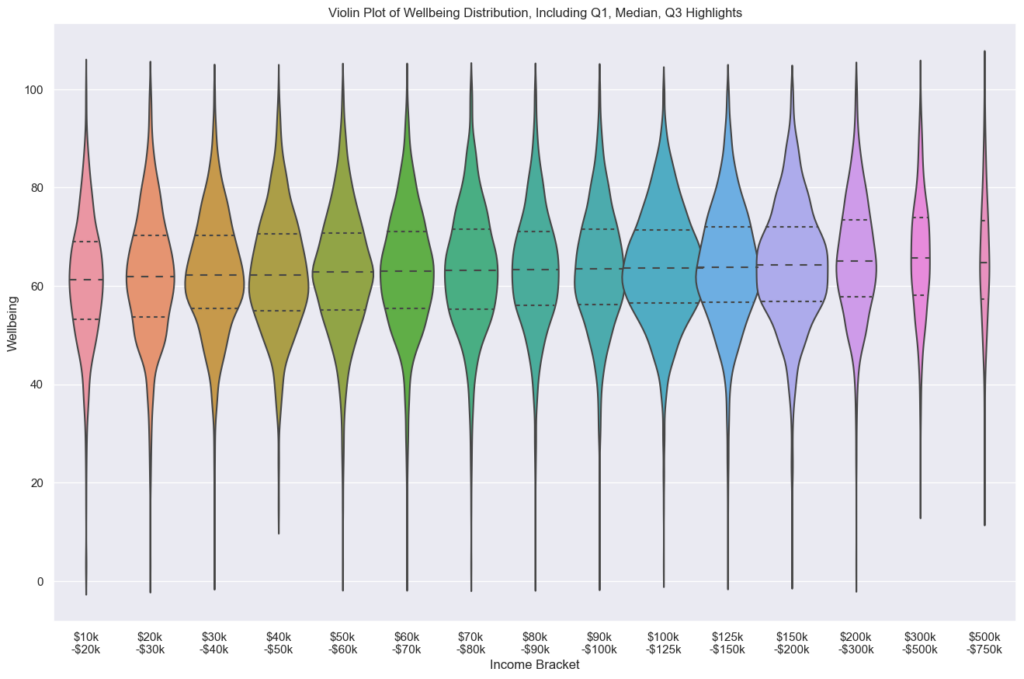
First I wanted an overview of the distributions, to get a feeling for the data. Seaborn has a nice and simple way to plot violin plots. The quantiles of the distribution, shown as dashed lines within the violines, seem to indicate a fairly clear upwards trend over the brackets.
It is important to note, that the brackets organized in this way, still are mostly logarithmic, as they get larger and larger. To alleviate this, I computed the 10th and 90th percentile in addition to the quartiles.
| Income Bracket | P10 | Q1 | Median | Q3 | P90 |
|---|---|---|---|---|---|
| $10k-$20k | 45.9867 | 53.14500 | 61.1750 | 68.94900 | 77.1774 |
| $20k-$30k | 47.0060 | 53.60100 | 61.8785 | 70.25600 | 78.6860 |
| $30k-$40k | 47.4220 | 55.34900 | 62.1260 | 70.18400 | 77.6935 |
| $40k-$50k | 48.2610 | 54.91400 | 62.2000 | 70.54600 | 78.2786 |
| $50k-$60k | 47.7432 | 55.17000 | 62.8250 | 70.68100 | 78.8980 |
| $60k-$70k | 48.6820 | 55.39100 | 62.9490 | 71.11300 | 78.8512 |
| $70k-$80k | 48.9280 | 55.27100 | 63.0960 | 71.45600 | 79.0130 |
| $80k-$90k | 49.1064 | 56.00800 | 63.3040 | 70.97600 | 79.2354 |
| $90k-$100k | 49.3025 | 56.25700 | 63.4340 | 71.54675 | 79.2570 |
| $100k-$125k | 49.9322 | 56.44700 | 63.5450 | 71.40300 | 79.2282 |
| $125k-$150k | 49.7290 | 56.61400 | 63.7900 | 72.06900 | 79.4690 |
| $150k-$200k | 49.8530 | 56.86500 | 64.1910 | 71.93700 | 79.9730 |
| $200k-$300k | 50.6540 | 57.70700 | 65.0000 | 73.41700 | 81.0800 |
| $300k-$500k | 50.9915 | 58.09625 | 65.6220 | 73.89550 | 81.2555 |
| $500k-$750k | 49.6628 | 57.27675 | 64.7130 | 73.28625 | 81.8000 |
Based on this information, I created a log-regression for a new visualization.
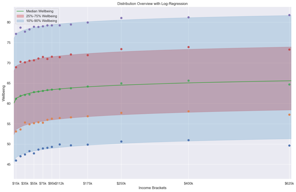
The authors of the original article note: There is not enough data to make any meaningful conclusions for the >$500k bracket, so lets ignore the seeming drop for the richest respondents to the survey.
For me, the more important thing to draw from this, is more related to the reddit comment I showed as an example. If you are unhappy at $30k, would you be happy at $60k?
Who knows, you are an individual not a statistic.
But, for a large population, the answer is who knows… While someone earning ~$400k unhappily (10th percentile) is still unhappier than 75% of people earning ~$15k, a person moving up in earning from $15k to $400k, might become happier. That’s not in the data.
It is important to realize though, that well-being is a wide spectrum within any earning bracket. There are many happy low-earners, as there are many unhappy high-earners.
So, best of luck /r/Empathetic_Orch, I hope you can make it to $60k quickly, and that it actually makes you happy. 🙂
The notebook used as python script.
ps: This is a random blogpost and I am not a professional in the relevant field. I just do this for fun, if you base any policy on a blogpost by and idiot like me, you are an idiot as well.